Mastering Visualizations in EDA — Univariate, Bivariate, and Multivariate Analyses
Exploring the Power of Visualization: An In-Depth Guide to Different Types of Visualizations for Quantitative and Qualitative Variables
Performing a thorough Exploratory Data Analysis (EDA) is crucial for any Data Science scenario, as it helps to gain a better understanding of the data and provides a stronger grip on the analysis goals.
Matplotlib and Seaborn offer a wide range of plots, each serving a specific purpose. Selecting the appropriate plot is essential to extract valuable insights from the analysis. As a Data Scientist, I have realized the significance of EDA and the role of these visualization tools in enhancing the quality of the analysis.
In this post, I will be emphasizing the visualization techniques used in EDA. It essentially involves three types of analyses: Univariate, Bivariate, and Multivariate Analysis, and visualization plays a crucial role in each.
To better understand how to approach EDA, it is essential to distinguish between numerical and categorical variables.
1. Exploring Quantitative and Categorical Variables

1.1. Quantitative Variables
Quantitative/ Numerical variables represent numbers and can be continuous or discrete. Continuous variables can take on any value within a range and can be measured on a continuous scale, such as the weight of students in a class.
Discrete variables can only take on certain values and can be counted, such as the number of treats given to a dog each day or the number of times someone misses the bus each week.
1.2. Categorical Variables
Categorical/ Qualitative variables, on the other hand, include everything that is not a number. They are variables divided into groups, each representing a specific category, such as sex, race, religion, country, state, city, or district. Although they cannot be measured on a numerical scale, they are crucial in organizing data into meaningful categories.
2. Data Visualization
Data Visualization is the process of representing complex information in visual formats, such as graphs, charts, and maps, in order to communicate insights and analysis more effectively.
Used across a wide range of fields, from science and technology to retail and finance, data visualization has become a critical tool for decision-making and communication.
2.1.1. Which visualization to use?

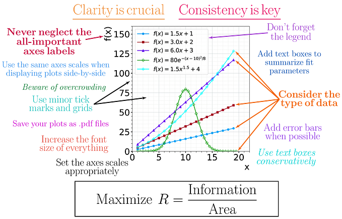
Effective data visualization is crucial for analyzing complex datasets. However, choosing the most appropriate visualization can be challenging due to the many available types. A poor choice can result in misinterpretation and confusion, underscoring the need to understand each visualization’s strengths and weaknesses. Let’s remedy the situation by carefully studying the various plots commonly used.
2.2. Univariate Analysis
Without further ado, let’s dive into the world of Univariate Analysis! It is a statistical technique that focuses on a single variable, feature, or data point in a given dataset.
This method helps in identifying patterns and outliers, which is a crucial step in any data science solution. It is an effective way to explore datasets for the first time, as it provides a quick and easy way to understand the basic properties of the data.
2.2.1. Histogram
The histogram is a popular graphical representation of a single continuous variable in a dataset. It contains vertical bars stacked together side by side, with the height of each bar representing the frequency of the observations falling within a particular range of values.
Histograms are useful in determining the spread, position, and shapes of distributions while also analyzing the skewness associated with them. The data are divided into intervals or bins, which display the frequency of observations within each bin.
# Plot the histogram of Blood Pressure of various candidates with 10 bins
df["BloodPressure"].hist(bins=10)
2.2.2. Distribution Plot
A distribution plot displays the distribution of the dataset by showing the frequency of continuous observations on the y-axis and the values of the variable on the x-axis. Sounds the same? Yes, pretty much! Except that a histogram is a type of bar chart, while a distribution plot gives us a smoothed estimate of the distribution function, thereby producing a density plot. Another key difference is that while a histogram is used for univariate analysis, a distribution plot is used for both univariate and bivariate analyses.
# Plot the kde of Blood Pressure of various candidates
sns.displot(pima['BloodPressure'], kind='kde')
plt.show()
2.2.3. Count Plot
A count plot is yet another visualization used for univariate analysis, but for categorical variables. Known for its simplicity, it displays the count of observations in a dataset for a single categorical variable. It is basically a bar plot where the height of each bar represents the count of observations in a particular category, typically used to identify patterns in the dataset by comparing frequencies. Count plots can be customized by changing the color and style of the bars, adding labels, and adjusting the axes.
# Count the number of winners in the World Cup
sns.countplot(x="Winner", data=data, order= data['Winner'].value_counts().sort_values(ascending=False).index)
plt.xticks(rotation=90)
plt.show() 
2.2.4. Pie Plot
A pie plot is a categorical univariate plot, used to represent numerical data in a circular form. The circle is divided into slices, and each slice represents a portion of the whole. The size of the portion is proportional to the quantity it represents, and the entire circle adds up to 100 percent.
A donut pie is a variant of the pie chart, with a hole in the center. The two are only different visually and they otherwise represent the same information.
# pie plot
plt.pie(mydata.Product.value_counts(), autopct = '%.1f%%', radius = 1.2, labels = ["TM195", "TM498", "TM798"])
# add a circle at the center
circle =  plt.Circle( (0,0), 0.5, color='white')
plot = plt.gcf()
plot.gca().add_artist(circle)

# display the plot
plt.show()

Advantages of Univariate Analysis
- It is a simple and quick way to gain insights into a single variable without the influence of any other variables by providing a foundation for more advanced statistical analyses, such as bivariate or multivariate analysis.
- It can help detect errors, missing values, or outliers in the data.
- Univariate analysis is easy to understand and communicate to non-technical audiences.
Disadvantages of Univariate Analysis
- It does not take into account the relationship between variables in a given dataset. This can possibly lead to misleading assumptions and incomplete conclusions.
2.3. Bivariate Analysis
Let’s now move to the next step in our data analysis journey — bivariate analysis. This step involves the examination of two variables simultaneously to determine their relationship, direction, strength, and significance. Bivariate analysis is particularly useful when trying to establish cause-and-effect relationships between variables and predict one based on the other.
2.3.1. Scatter Plot
Scatterplots are a highly popular and commonly used visualization tool among data scientists for both Exploratory Data Analysis (EDA) and Hypothesis Testing. These plots display the relationship between two continuous variables, with each data point representing an observation of the two variables, where one variable is plotted on the x-axis and the other on the y-axis.
They serve as an excellent means of identifying patterns or trends in the data, such as positive or negative correlation, clusters of data points, and outliers. Moreover, they allow us to identify the presence of nonlinear relationships between variables, such as quadratic or exponential relationships, which can have a significant impact on our analysis.
# Create a scatterplot for the variables Glucose and Insulin
sns.scatterplot(x='Glucose',y='Insulin',data=df, color='green')
plt.show()
2.3.2. Line Plot
Line plots, also known as line graphs, are used to display the relationship between two continuous variables over time. To construct a line plot, the values of the two variables are plotted on the x and y axes, and the data points are connected with straight lines.
Line plots are useful for identifying increasing or decreasing trends, and they are commonly used for time-series analysis. They help visualize the behavior of a variable over time, and trends in two or more variables can be compared using line plots.
# Uber Pickups across Months
cats = df.start_month.unique().tolist()
df.start_month = pd.Categorical(df.start_month, ordered = True, categories = cats)
plt.figure(figsize = (20, 7))
sns.lineplot(x = "start_month", y = "pickups", data = df, ci = True, color = "RED", estimator = 'sum')
plt.ylabel('Total pickups')
plt.xlabel('Month')
plt.show()
2.3.3. Box Plot
The box-and-whisker plot is an interesting visualization tool that is constructed by plotting a rectangular box with whiskers on both sides. The rectangular box represents the interquartile range (IQR), the central line inside the box represents the median (50th percentile), and the whiskers represent the minimum and maximum values of the selected feature(s).
Box plots are typically used when one variable is continuous and the other is categorical, or vice versa. They are highly effective in identifying outliers, the spread of data, and central tendencies.
# Box plot of Goals scored in the FIFA World Cup
plt.boxplot(fifa['GoalsScored'])

plt.text(x=1.1,y=fifa['GoalsScored'].min(), s='min')
plt.text(x=1.1,y=fifa.GoalsScored.quantile(0.25), s='Q1')
plt.text(x=1.1,y=fifa['GoalsScored'].median(), s='median(Q2)')
plt.text(x=1.1,y=fifa.GoalsScored.quantile(0.75), s='Q3')
plt.text(x=1.1,y=fifa['GoalsScored'].max(), s='max')

plt.title('Boxplot of GoalsScored')
plt.ylabel('Goals')
plt.show()
# Bivariate Analysis (categorical vs numerical)
import seaborn as sns

sns.boxplot(x="Gender", y="Age", data=mydata)
2.3.4. Swarm Plot
A swarm plot is a variation of a scatter plot where the points are adjusted to prevent overlap and ensure visibility, making it a more organized version.
It is used to visualize the relationship between a continuous and categorical variable and is particularly useful for smaller datasets with discrete values or categories.
Unlike a traditional scatter plot where points can overlap, a swarm plot arranges them in a way that allows each point to be clearly visible.
# swarm plot
sns.swarmplot(y = 'tip', x = 'time', data = tips_data, palette="muted")

# display the plot
plt.show()
2.3.5. Strip Plot
A strip plot is a type of chart where one variable is categorical, and it resembles a scatterplot with overlapping points. Unlike a swarm plot, strip plots allow points to overlap, giving a more accurate representation of the data. They are useful in visualizing small to medium-sized datasets and have similar applications to swarm plots.
# strip plot with jitter to spread the points
sns.stripplot(y = 'tip', x = 'time', data = tips_data, jitter = True, palette="dark")

# display the plot
plt.show()
2.3.6. Violin Plot
The Violin plot may have a fancy name, but it also has a fancy look. It combines the features of a box plot and a kernel density plot. The violin plot is used to represent the distribution of a numerical variable across different categories.
Like the box plot, it can identify central tendencies, ranges, and outliers, but it also provides a density estimation of the data, giving a better understanding of the distribution.
# Violin Plot for total bill through the days Thur, Fri, Sat, and Sun
sns.violinplot(x="Product", y="Age", data=mydata)
2.3.7. Stacked Bar Plot
Last but not least, the stacked bar chart is a popular visualization used to show the relationship between two categorical variables. Each category is represented by a bar, divided into segments that represent subcategories, with the height of each segment representing the value of the subcategory for the given category. The segments are stacked on top of each other, allowing for easy comparison of both the individual subcategory values and the overall category values.
import matplotlib.pyplot as plt
import numpy as np

# Sample data
data = np.array([[10, 20, 30], [5, 15, 25], [15, 5, 10]])

# Create labels for the X-axis
x_labels = ['Category 1', 'Category 2', 'Category 3']

# Create labels for the legend
legend_labels = ['Subcategory 1', 'Subcategory 2', 'Subcategory 3']

# Set the width of each bar
bar_width = 0.8

# Create a stacked bar plot
plt.bar(x_labels, data[:, 0], label=legend_labels[0], width=bar_width)
plt.bar(x_labels, data[:, 1], bottom=data[:, 0], label=legend_labels[1], width=bar_width)
plt.bar(x_labels, data[:, 2], bottom=data[:, 0] + data[:, 1], label=legend_labels[2], width=bar_width)

# Add a legend
plt.legend()

# Add labels to the X and Y axis
plt.xlabel('Categories')
plt.ylabel('Values')

# Show the plot
plt.show()
Advantages of Bivariate Analysis
- Bivariate analysis assists in analyzing two variables and their relationship with each other, which may otherwise not be visible in univariate analysis.
Disadvantages of Bivariate Analysis
- Sometimes, when the underlying statistical concepts are not clearly understood, certain relationships can be misinterpreted.
- Working with large datasets can be an expensive affair when we talk about analyzing only two variables at a time.
2.4. Multivariate Analysis
To fully explore and understand a dataset, it’s important to analyze multiple variables at once. This can be done using two powerful plots in seaborn: the pair plot and the heat map. These multivariate charts allow for the determination of correlations between variables and are a crucial step in the EDA process.
2.4.1. Pair Plot
A pair plot is a useful tool for visualizing the relationships between multiple continuous variables. It is comprised of a matrix of scatterplots, with each plot showing the relationship between two variables.
The diagonal of the matrix consists of KDE plots that display the distribution of a single variable. This type of plot is particularly useful when exploring a large number of variables to quickly identify patterns and relationships.
#Pairplot for the variables Glucose, SkinThickness, and DiabetesPedigreeFunction
sns.pairplot(data=df,vars=['Glucose', 'SkinThickness', 'DiabetesPedigreeFunction'], hue='Outcome')
plt.show()
2.4.2. Heat Map
A heat map is a graphical representation of data in a matrix or table format, where each cell is assigned a color based on its value. The colors typically range from high to low values, allowing for easy identification of areas with high or low concentrations that may not be immediately apparent from the raw data.
# Heat map
plt.figure(figsize=(8,8))
sns.heatmap(corr_matrix, annot = True)

# display the plot
plt.show()
Advantages of Multivariate Analysis
- Multivariate analysis allows us to examine more than two variables simultaneously, providing a comprehensive understanding of the underlying patterns and relationships within the dataset, including any latent or concealed patterns.
Disadvantages of Multivariate Analysis
- As it requires a large amount of data to accurately represent relationships, a multivariate analysis could be computationally intensive and complex.
3. Conclusion
In conclusion, data visualization plays a crucial role in exploratory data analysis, as it helps us understand our data better. While univariate analysis gives us insights into individual variables, bivariate and multivariate analysis allows us to establish connections and patterns between variables that might not be apparent otherwise.
As we have seen, there are many visualization techniques to choose from, and selecting the right one can make a significant impact on the effectiveness of our analysis.
Therefore, mastering the art of data visualization is a valuable skill for any data analyst or scientist.